
Population structure and ageing: a visual comparison
News articles
December 22, 2024
Demography tells the story of our lives. It is about how old we are likely to become, how many children we can expect to have, and where and how we are likely to spend our lives.
Demographic change has a powerful impact on our economies, welfare, health systems, and housing and infrastructure needs in Europe's regions. This, in turn, has implications for government budgets and policies.
EU policy addresses the challenges of population change, shrinkage, and ageing through a multifaceted approach. This includes measures aimed at boosting workforce participation, such as promoting lifelong learning and supporting the integration of migrants into the labour market. Policies also focus on ensuring the long-term sustainability of social security systems and addressing the needs of an ageing population through investments in healthcare, long-term care, and active ageing initiatives. Furthermore, the EU supports measures to revitalize shrinking regions by promoting innovation, entrepreneurship, and sustainable development. These policies aim to mitigate the negative impacts of demographic change and ensure a prosperous and inclusive future for all Europeans.
To better understand the impact of demographic ageing within the European Union (EU), which is likely to be of major significance in the coming decades, ESPON created a handy Dashboard that enables users to browse the changes in median age and in 5-year age groups over time and tailor the search to fit their specific analysis needs.
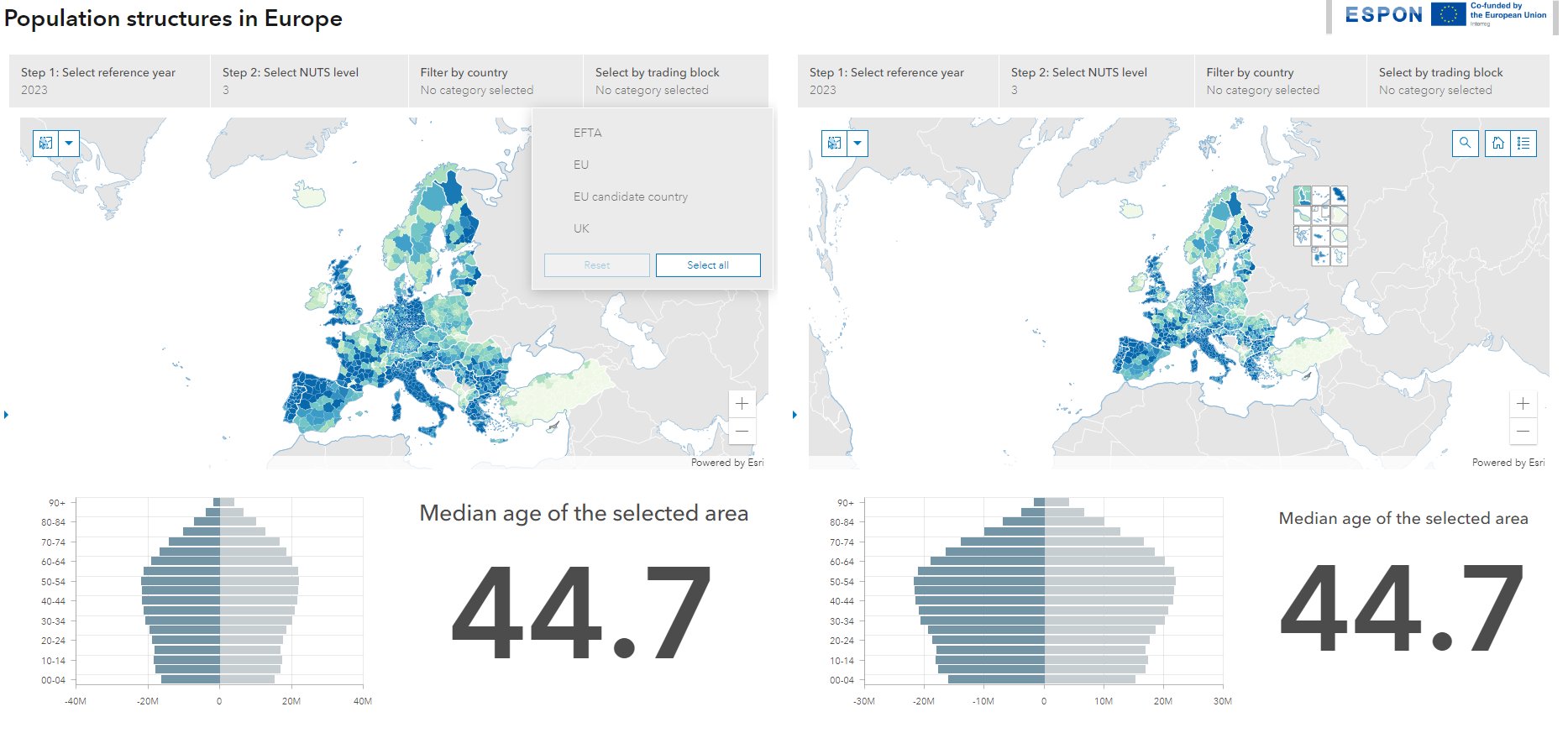
The dashboard is based on the joint effort of ESPON and JRC to build a harmonised set of demographic indicators that are spatially complete and focus on long-time series. This visual representation on the map allows for a quick and intuitive understanding of the distribution age structure across the continent.
How to read and use the dashboard
The two identical side-by-side views can be used to make comparisons between the two selections. Areas on the maps dominated by darker shades indicate a higher concentration of higher median age, while lighter shades signify a prevalence of lower median age. The population pyramids accompanying the maps offer a wealth of information about the age and gender distribution within selected areas. The vertical axis represents age groups, while the horizontal axis shows the population size for each gender. The left side of the pyramid represents males, while the right represents females.
The filters help users to focus on a set of countries or a particular country, select the right territorial level, NUTS0, NUTS1, NUTS2 or NUTS3, a territorial typology if the interest is to focus on urban-rural differences or territorial specificities (the selectors can be expanded by clicking on the small arrow on the right side of the maps). In addition, the map interface allows users to make further customisations in their selections.
Applications for Policymakers, Researchers, and Journalists
This interactive dashboard serves as a valuable tool for various professionals:
- Policymakers: Can utilise the dashboard to identify regions with ageing populations, enabling them to develop targeted policies related to healthcare, pensions, and social support systems. The visualisation of regional variations in age structure can inform decisions regarding infrastructure development, resource allocation, and regional planning.
- Researchers: Can leverage the dashboard or the data behind it to investigate the factors contributing to population ageing and regional disparities in demographic structures. The tool can be used to explore correlations between age distribution, socioeconomic indicators, and health outcomes.
- Journalists: Can employ the dashboard to create data-driven stories and visualisations about demographic trends in Europe. The maps and pyramids provide compelling visuals to illustrate articles on population ageing, regional disparities, and social issues related to age and gender.